Brand Evolution
Rationale

Red Hills Lab
Man in brown jacket smiling and looking up outdoors with snow-covered trees in background.
By | Precious Akinbo | Published on July 14, 2026 | 2 min read

Introduction

Why Evolution Instead of Redesign
The Red Hills Lab project began with a fundamental question: Does the brand truly reflect the studio it has become?

Rather than approaching the project as a complete rebrand, the objective was to understand the existing identity, identify its strengths, and determine whether the business required reinvention or strategic refinement.

Following an in-depth review of the existing brand guidelines, website, messaging and visual identity, it became clear that Red Hills Lab already possessed valuable brand equity. The name was distinctive, the hill-inspired logo was memorable, and the ownership of the colour red created immediate recognition. These assets had already established familiarity and should not be discarded.

The challenge was not that the identity lacked creativity. It was that the identity no longer reflected the scale of the studio's ambition.

As Red Hills Lab evolved toward serving hospitality, lifestyle, wellness, tourism, retail and experience-led businesses, its visual identity needed to evolve alongside it. The objective therefore became one of strategic evolution rather than replacement—preserving the strongest elements of the existing identity while building a more confident, cohesive and scalable brand system around them.

Every decision throughout this project was guided by one principle:
Strengthen what already works. Refine what no longer serves the future.

Strategic Repositioning

From Creative Lab to Brand Experience Studio
The audit concluded that Red Hills Lab did not require a new identity.It required a new perception.

The project therefore shifted away from redesigning individual assets and instead focused on repositioning the business as a specialist Brand Experience Studio.

This repositioning reflects the type of work Red Hills Lab creates and the industries it serves. Rather than functioning as a general creative agency, the studio specialises in identities, digital experiences and visual systems for businesses that people physically experience—restaurants, hotels, wellness brands, retail spaces, destinations and cultural venues.

This repositioning established a clearer strategic direction for every subsequent design decision.

To ensure consistency throughout the project, five core brand attributes were defined as evaluation criteria for every element of the identity:
Creative
Confident
Strategic
Human
Premium

These attributes were not intended as descriptive words, but as measurable design filters. Every colour, typeface, layout, photograph and communication decision was evaluated against them.

The repositioning also introduced a central idea that would guide the entire visual system:
Brands Worth Experiencing.
Rather than simply designing attractive identities, the objective became creating brands that people genuinely experience—physically, emotionally and digitally.

This philosophy became the creative north star of the project.
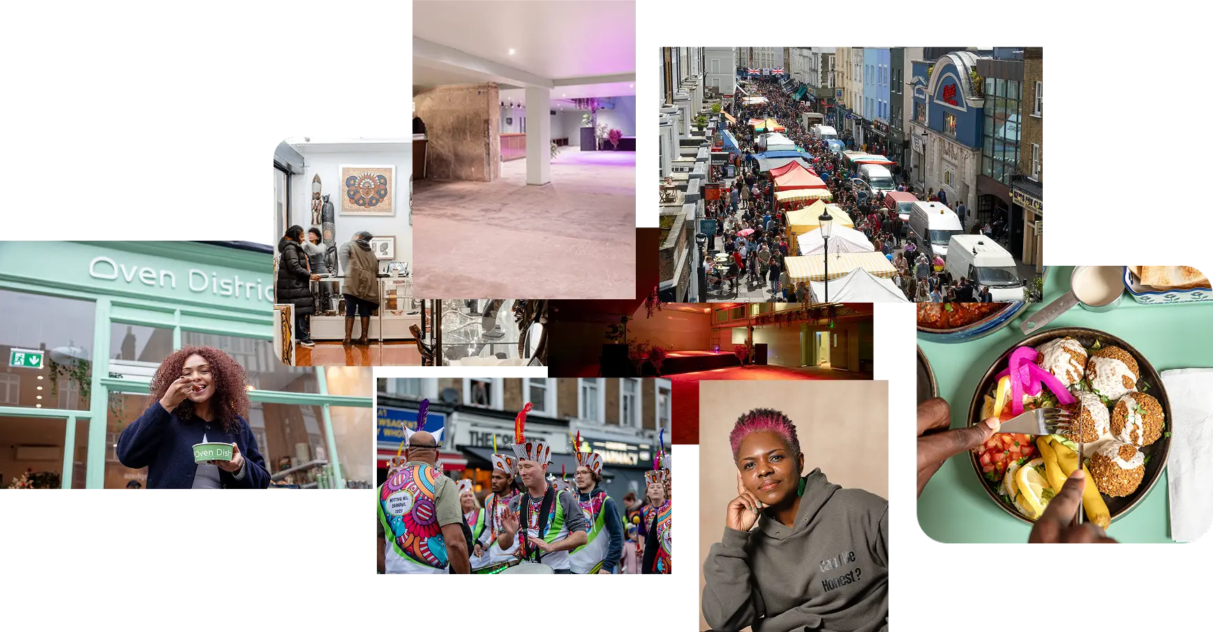
Collage of community scenes including street market, cultural parade, food, gallery, and portraits.

Visual System

Translating Strategy into Design
Every component of the identity was intentionally developed to reinforce the repositioning of Red Hills Lab as a confident, contemporary Brand Experience Studio.

Typography
Typography became one of the primary expressions of confidence.

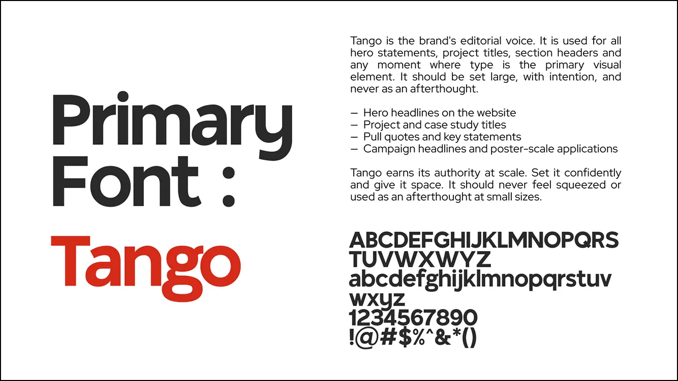
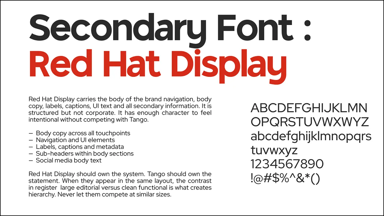
The previous typography system lacked the visual authority expected of a premium creative studio. The new system introduces a clear distinction between expressive editorial headlines and functional supporting information.

Large display typography creates immediate presence, establishes hierarchy and communicates confidence before a single sentence is read. Supporting typography prioritises clarity, readability and consistency, allowing the work itself to remain the primary focus.

Together, the type system balances expression with usability.
Popular Posts
Sliced pizza with chicken, onions, and cilantro on a wooden board.
Product
Lorem ipsum dolor sit amet, consectetur adipiscing elit.
Sliced pizza with chicken, onions, and cilantro on a wooden board.
Product
Lorem ipsum dolor sit amet, consectetur adipiscing elit.
Sliced pizza with chicken, onions, and cilantro on a wooden board.
Product
Lorem ipsum dolor sit amet, consectetur adipiscing elit.
Sliced pizza with chicken, onions, and cilantro on a wooden board.
Product
Lorem ipsum dolor sit amet, consectetur adipiscing elit.
Get More Done Together With US
Lorem ipsum dolor sit amet, consectetur adipiscing elit.
Specimen of Tango font showing uppercase, lowercase, numbers, symbols, and usage guidelines.
Typography sample showing Red Hat Display as a secondary font with letters, numbers, and symbols.
Colour System
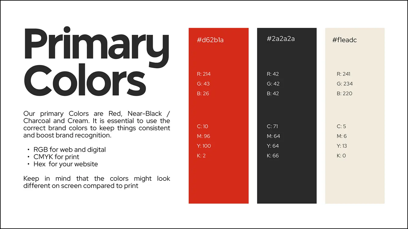
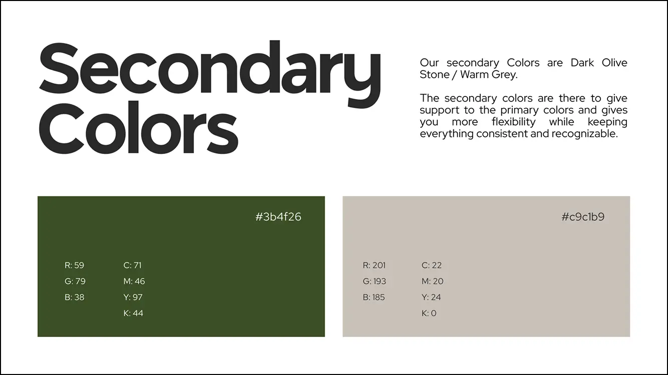
Rather than introducing an entirely new palette, the colour system evolves the existing visual territory.

Red remains the defining asset of the identity because it is intrinsically connected to the brand name and already possesses strong recognition value.

Supporting colours were refined to create greater warmth, sophistication and flexibility while /allowing red to remain the dominant visual anchor.

This approach strengthens familiarity while elevating overall perception.

Brand primary colors: red, near-black charcoal, and cream with RGB, CMYK, and Hex values.
Secondary colors shown as dark olive stone (#3b4f26) and warm grey (#c9c1b9) with color codes.
Shape Language
The hill-inspired logo represented one of the strongest assets identified during the audit, making it essential to preserve and expand rather than replace.

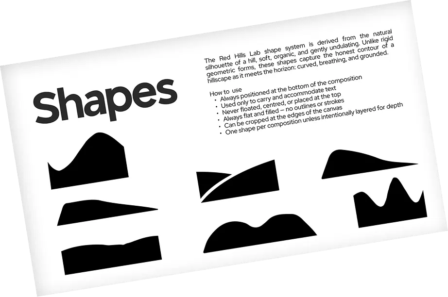
During the evolution process, particular attention was given to the supporting graphic shapes used throughout the identity. The previous system interpreted the idea of "hills" using irregular, angular outlines with sharp, rugged edges. While visually distinctive, these forms more closely resembled mountain peaks than the softer, rolling landscape suggested by the brand name.

To strengthen the conceptual integrity of the identity, the supporting shapes were redesigned as smooth, organic silhouettes inspired by the natural horizon line of rolling hills. Their gentle curves create a visual language that feels grounded, approachable and authentic, while remaining unmistakably connected to the existing logo and the idea of Red Hills.

Beyond improving conceptual accuracy, these new forms also perform a functional role within the system. Rather than existing as decorative graphics, they act as compositional devices that anchor layouts, provide a natural foundation for typography and create rhythm across applications. Positioned consistently at the base of compositions, they evoke the feeling of landscape while giving content a clear place to live.

This evolution transforms the hill concept from a symbol contained within the logo into a cohesive visual language that extends naturally across the entire brand system. Every curve reinforces the central idea behind the identity, ensuring the brand doesn't simply reference hills in name alone, but expresses them consistently throughout every touchpoint.

Black abstract hill silhouette shapes inspired by nature with usage rules on white background.
Image Direction
One of the most significant developments within the project was the creation of a dedicated image philosophy.

Rather than treating photography as supporting decoration, imagery became a strategic communication tool.

The central principle is simple:

The most powerful image for a Brand Experience Studio is the design work living inside the experience..

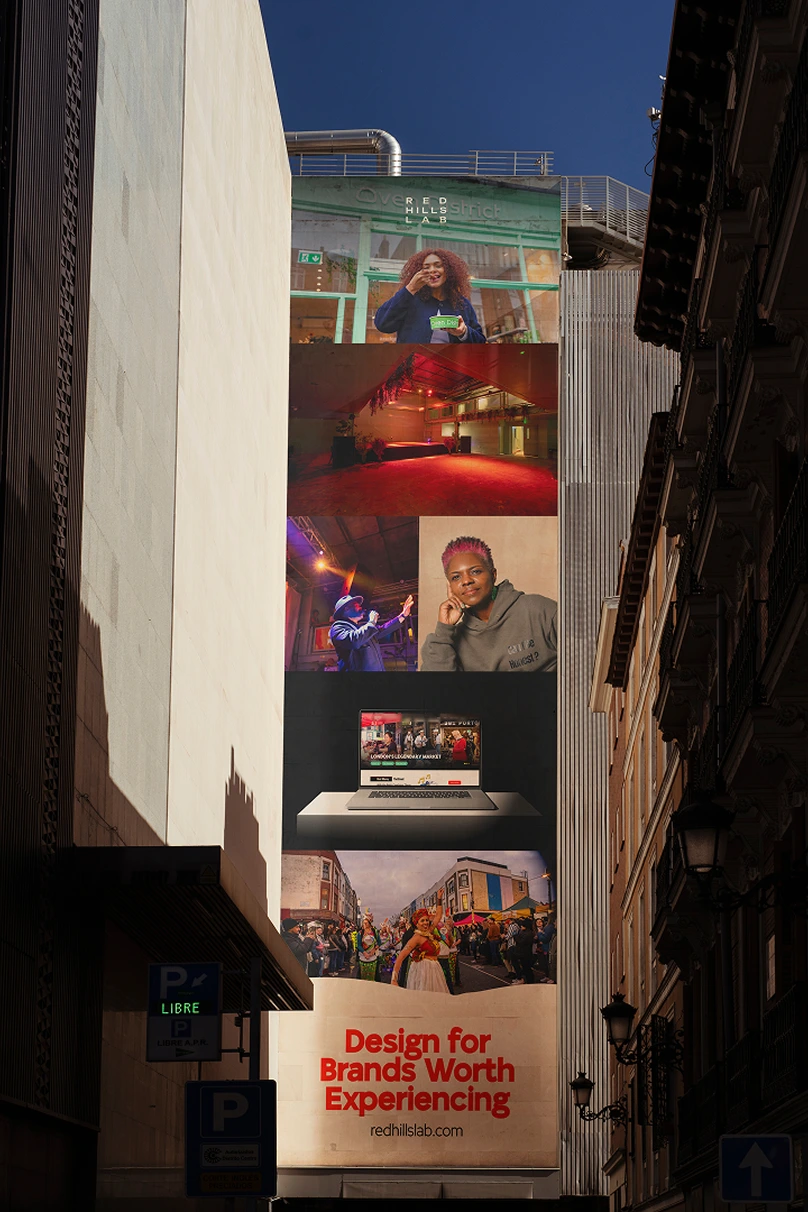
Instead of isolated mockups or generic lifestyle photography, the preferred imagery captures brands existing within real environments—restaurants in operation, signage within spaces, packaging in use and people interacting with branded experiences.
This approach demonstrates not only what was designed, but what it feels like to encounter the brand in the real world.

To support consistency, imagery was organised into three hierarchical layers:
Work in Context
Experience & Atmosphere
Design Documentation

This hierarchy ensures every visual communication reinforces the studio's positioning as a creator of memorable experiences rather than isolated visual assets.

Layout System
The layout system embraces simplicity, hierarchy and restraint.
Generous whitespace, strong alignment and bold typographic scale create breathing room that allows each element to communicate with clarity.

Space is treated as an active design element rather than empty background, reinforcing both the premium positioning and the editorial quality of the identity.

Every composition is designed to feel intentional rather than decorative.

Tone of Voice
The verbal identity was refined to reflect the maturity of the repositioned studio.
Communication is direct, confident and human.

Rather than speaking about internal processes or personal journeys, the language focuses on outcomes, experiences and the value created for clients.

This shift moves the brand away from sounding like an individual creative practitioner and toward communicating as an established design studio with a clear point of view.
Canvas tote bag with red handles hanging on a wooden chair, text reads For Brands Worth Experiencing.
Vertical building banner with photos and text: Design for Brands Worth Experiencing, redhillslab.com.
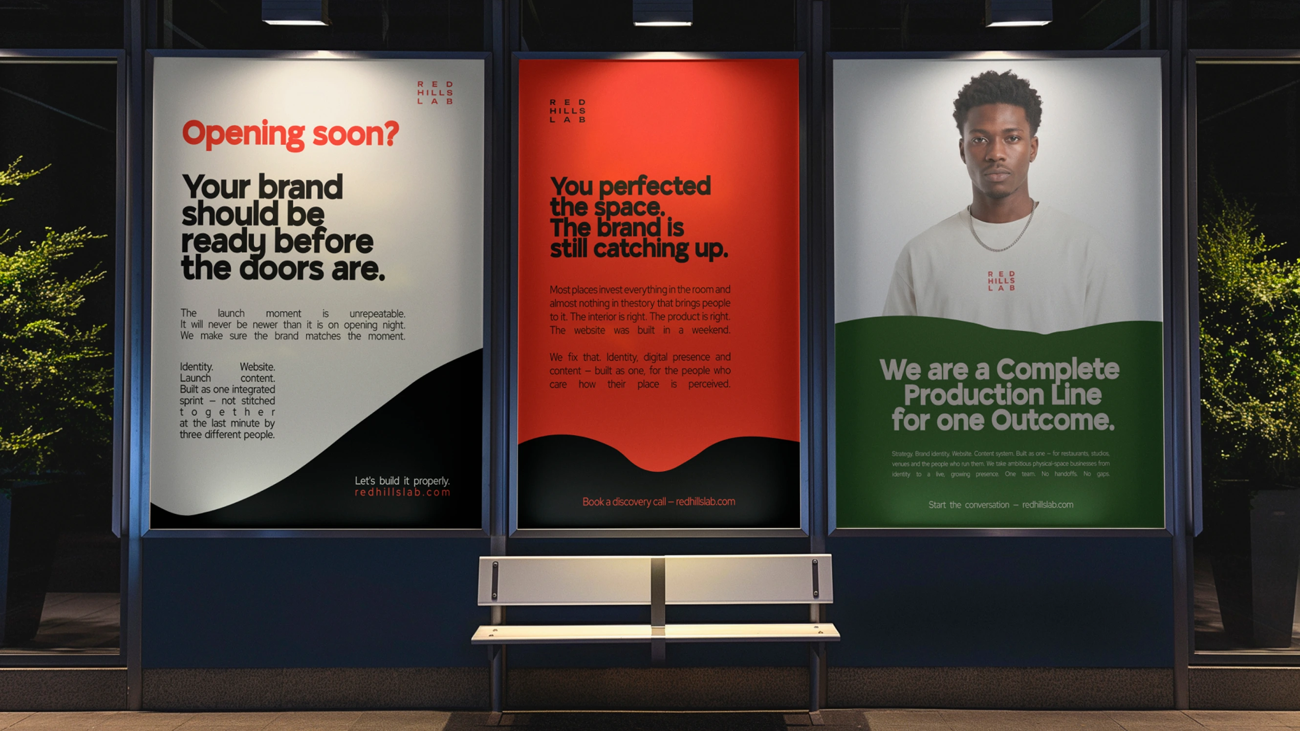
Three backlit posters on a wall: brand readiness, brand catching up, and complete production line with man portrait.

Outcome

A System Designed for Growth

The outcome of this project is not simply an updated visual identity.

It is a strategic brand system.

By preserving the strongest assets of the existing identity while introducing a more coherent creative framework, Red Hills Lab now presents itself in a way that better reflects both its expertise and its future ambitions.

The evolved system communicates confidence without sacrificing creativity, premium quality without losing warmth, and strategic thinking without becoming overly corporate.

Most importantly, it provides a scalable foundation capable of supporting future growth across digital platforms, environmental graphics, presentations, social media, campaigns and client experiences.

This project demonstrates that meaningful branding is not always achieved through reinvention.

Sometimes the greatest transformation comes from recognising what is already valuable, understanding what needs to change, and building a stronger system around it.

That is the role of strategic brand evolution.